northstar
Media unavailable. Open original
Media unavailable. Open original
Media unavailable. Open original

Media unavailable. Open original
Media unavailable. Open original
Media unavailable. Open original
Media unavailable. Open original
Media unavailable. Open original
Media unavailable. Open original
Media unavailable. Open original
Media unavailable. Open original
Northstar — project info
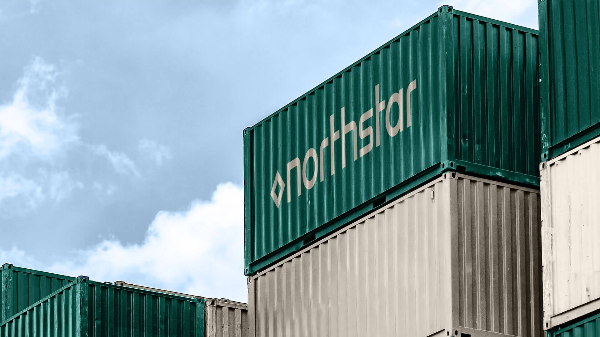
When Swedish paper company Korco set out to launch a new brand of sustainable paper cup stock, the goal was ambitious: create an identity that could reflect both Scandinavia’s deep heritage and its progressive future in sustainability.
The brand was named Northstar - a symbol of ambition and navigation - rooted in Scandinavian folklore and aligned with the company’s vision of guiding the industry toward higher standards. At the center of the identity is the Nord symbol, derived from the runic alphabet meaning “life,” a modern custom mark that connects past and future. A simplified monogram extends the system for smaller applications.
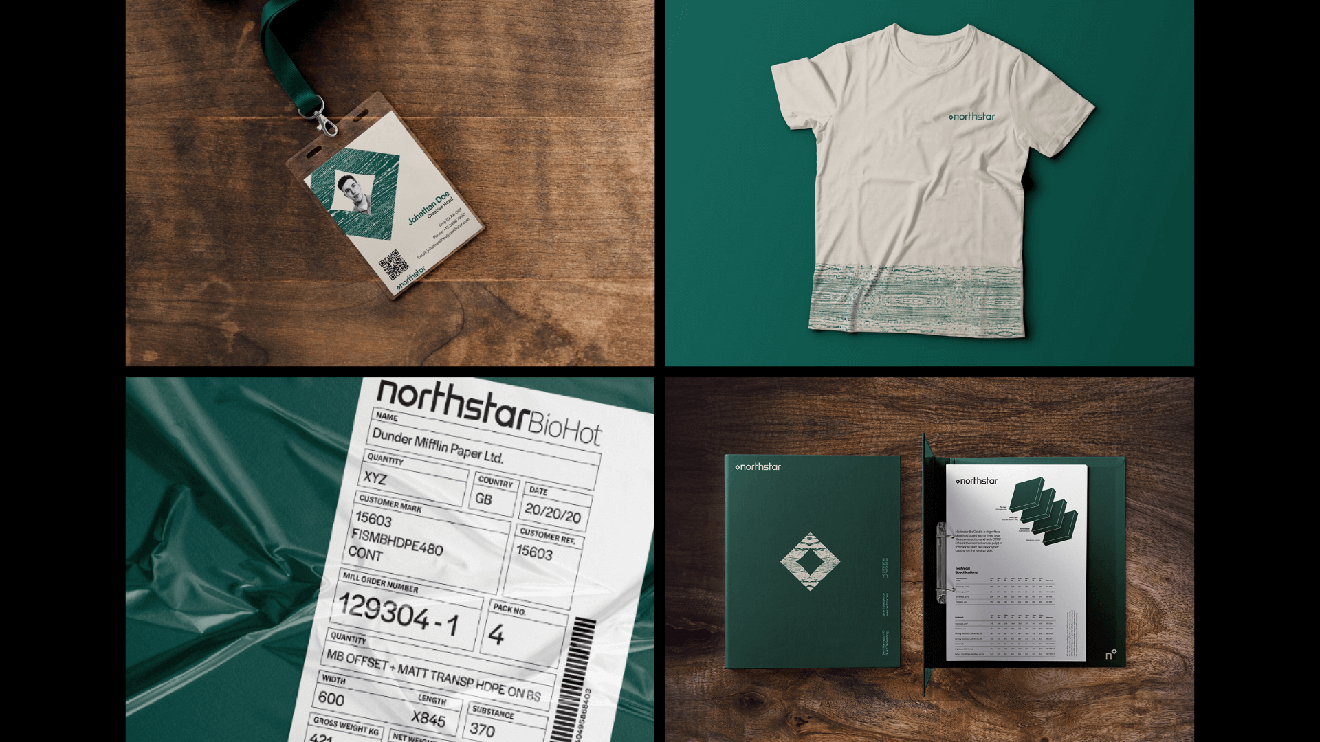
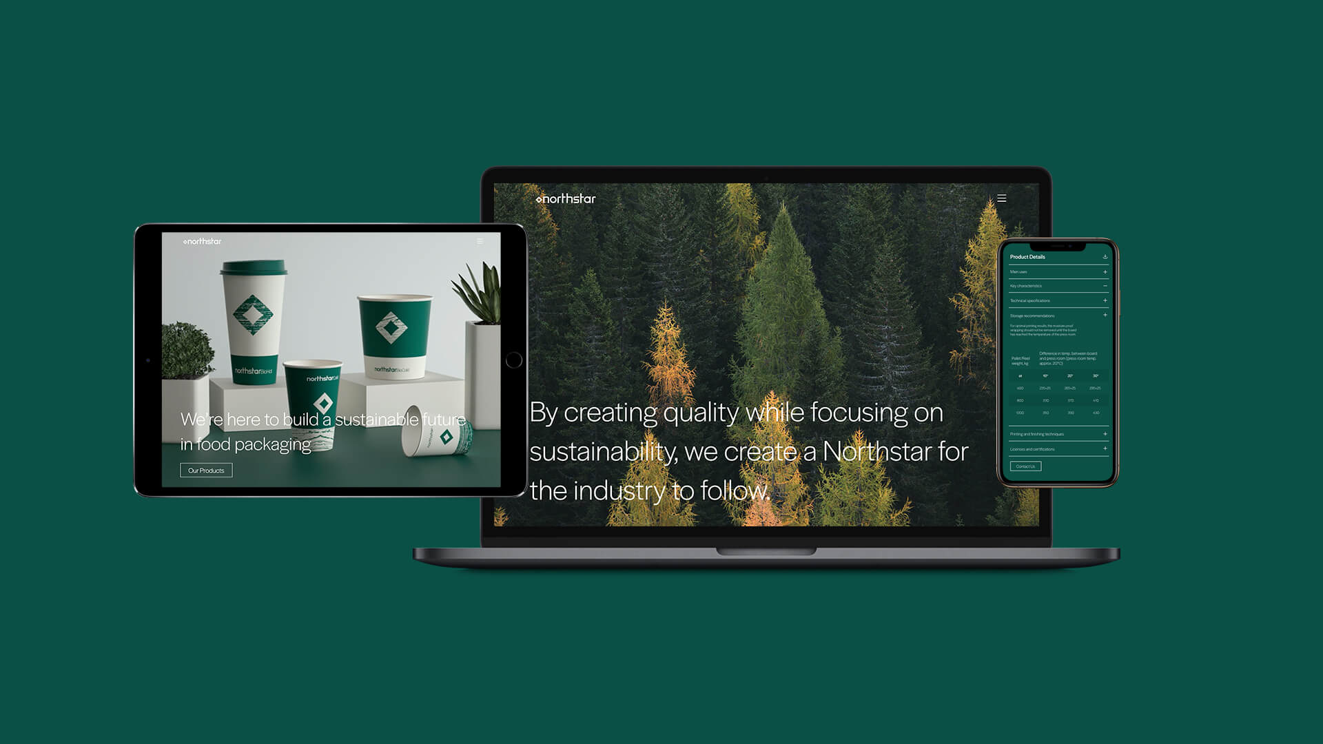
We designed a utilitarian but flexible visual system. The color palette draws from the Scandinavian seasons - lush greens, warm browns, crisp whites - while patterns are inspired by natural textures like tree rings. Halyard Grotesk Sans provides consistency and versatility, ensuring clarity across scales.
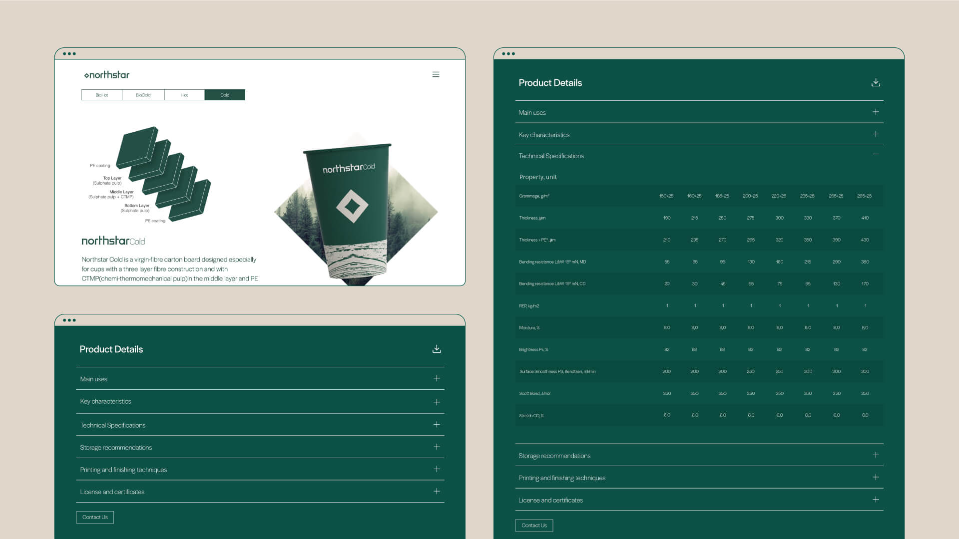
The design language was built with the team’s everyday use in mind, from packaging to mnemonics for cup variants, ensuring it was not only iconic but also practical and scalable. The result is a brand identity that feels grounded in cultural authenticity while pushing forward Korco’s mission of sustainability.