collectius
Media unavailable. Open original
Media unavailable. Open original
Media unavailable. Open original
Media unavailable. Open original
Media unavailable. Open original
Media unavailable. Open original
Media unavailable. Open original
Collectius — project info
Debt collection in Asia has long been an industry associated with aggressive practices and mistrust. Collectius was founded on a different principle: that “doing good is good for business.” Instead of short-term recovery, they wanted to create sustainable systems where people could repay debts through fair, transparent, and long-term plans.
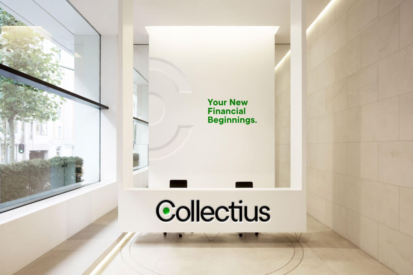
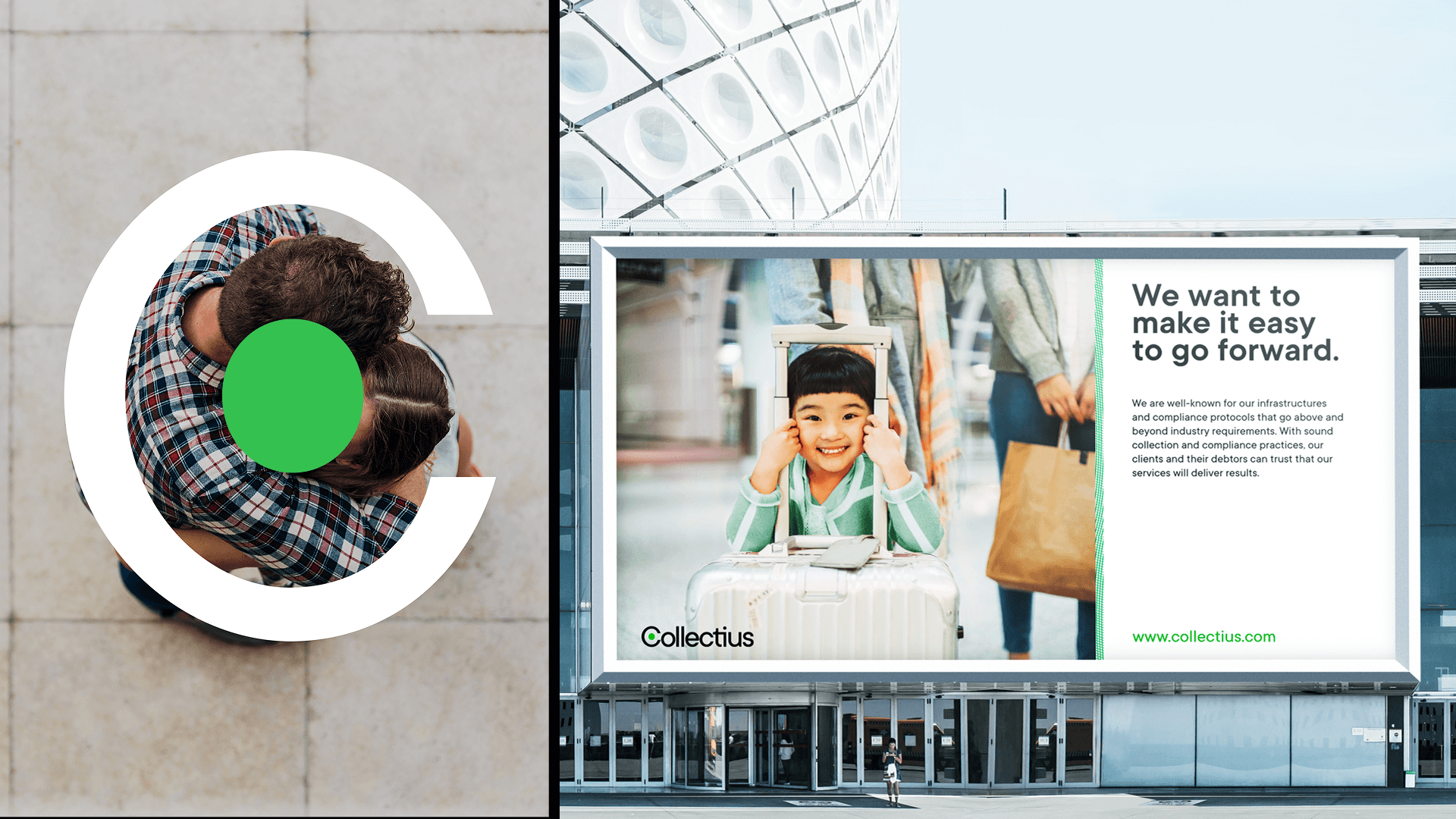
Our role was to translate this purpose into a brand that felt human and approachable. Through workshops, we helped Collectius define their positioning and communication, which informed a complete visual rebrand. At its center is the Collectius Embrace - a logo where the “C” becomes a symbol of protection and support.
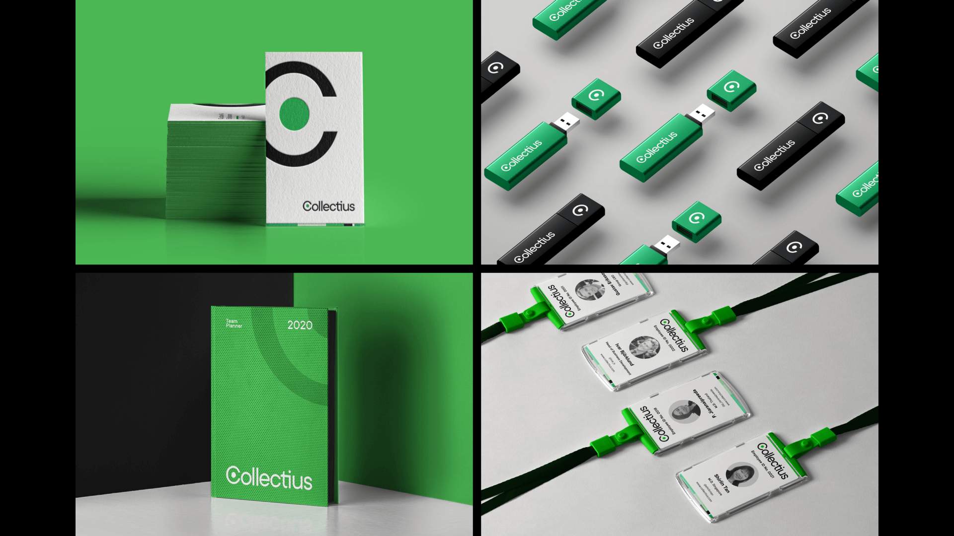
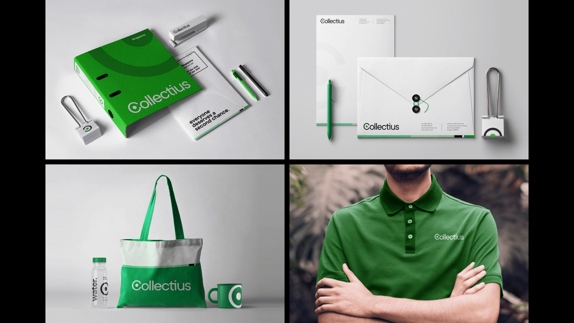
The design language expands from this core idea. A refreshed green palette conveys growth and harmony, supported by monochromatic tones for balance. Guilloché-inspired patterns - abstracted from the building blocks of the global economy - add a subtle layer of depth and futurism. TT Commons, a versatile geometric sans serif, brings clarity across applications, supported by a system of icons designed for both print and digital.
Practicality was central to the system. From custom charts and graphs compatible with PowerPoint to mnemonics that simplified internal processes, the identity was built to work seamlessly in Collectius’s day-to-day. The result is a modern, optimistic brand that makes debt collection approachable while staying rooted in its mission of empowering people financially.